BIRD SCOOTERS
Poster Design | Product Service System | Type & Grid | Individual
CHALLENGE
How can we easily explain how a product service system works through visual design?
PROMPT
Create a poster which informs an audience about how a specific product service system works.
DELIVERABLES
process book, final poster
SKILLS
sketching, gridding, type hierarchy, PSS-mapping
RESPONSE
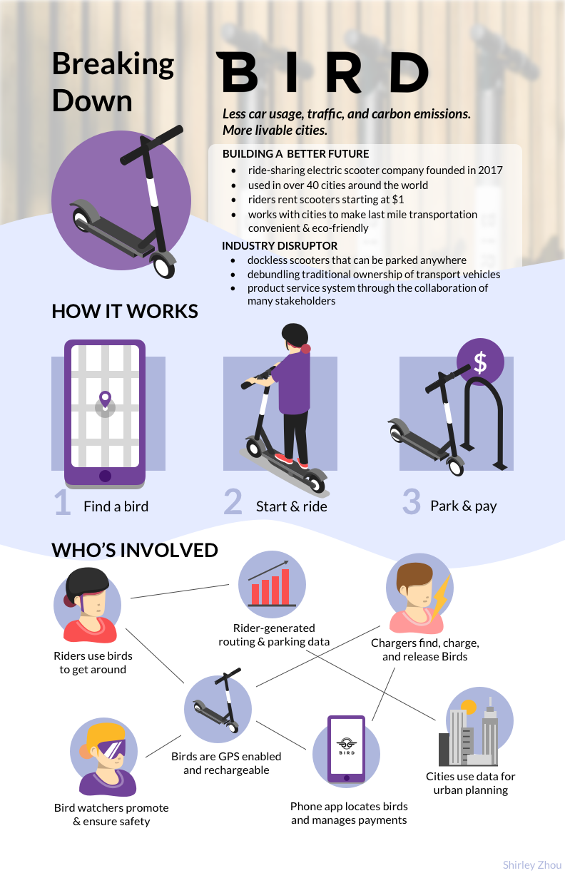
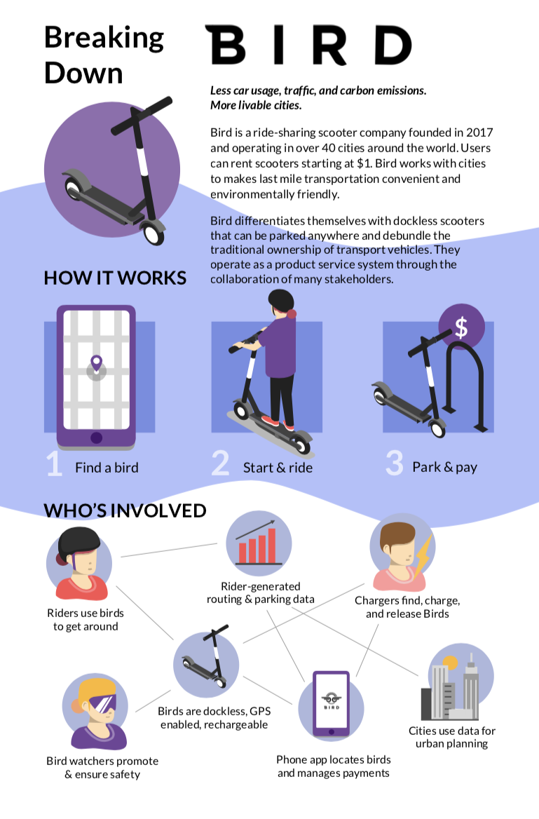
I created a poster explaining how Bird is a product service system and breaking down the stakeholders and products and services involved in making it so.
RESEARCH & BRAINSTORMING
The first step I took was to go online and do some research on product service system (PSS) companies that I was interested. I took time to sketch out how I understood their different PSS models to work and looked into the different stakeholders and services involved in each.
CARE / OF
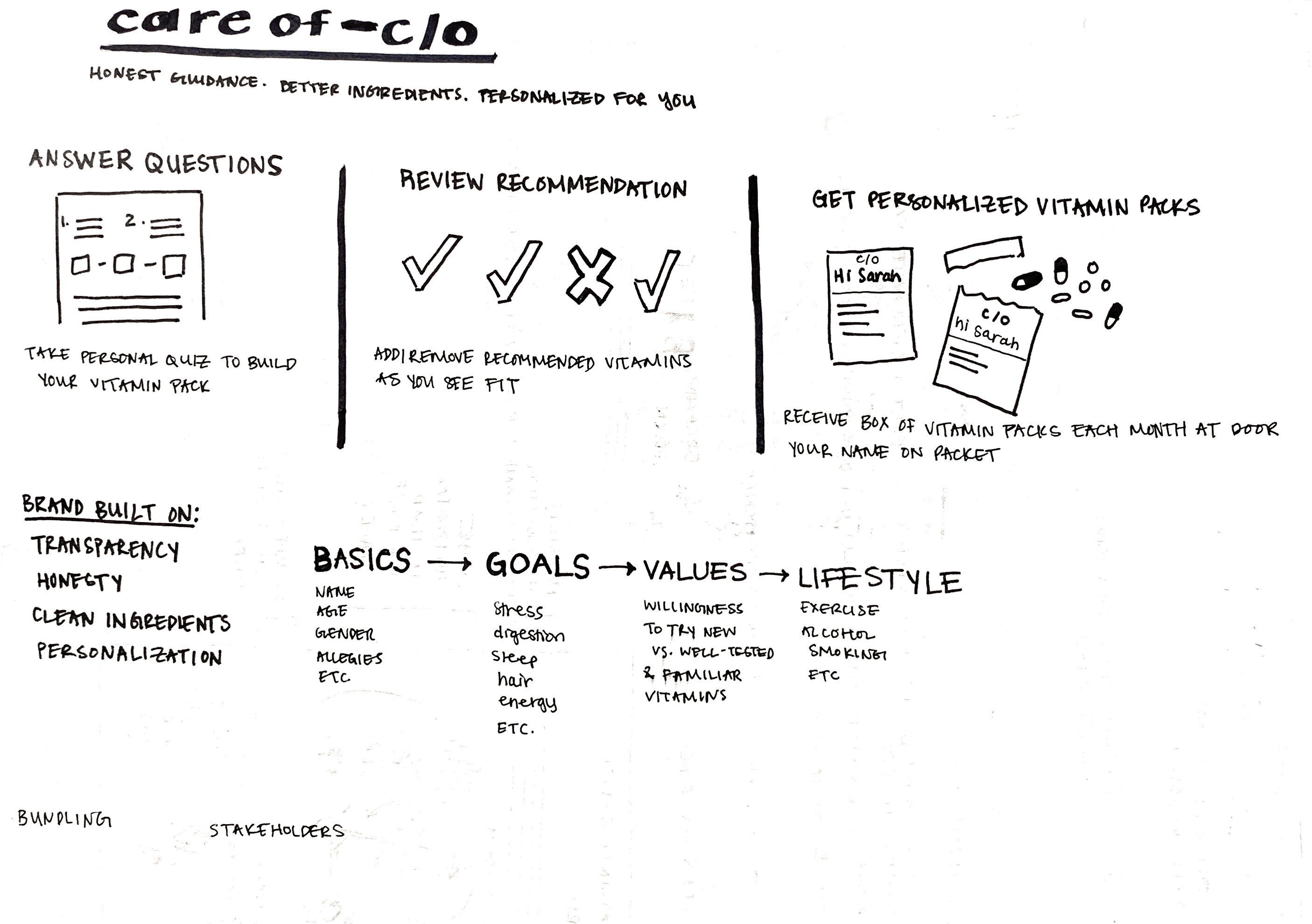
Care/of delivers personalized vitamin packets to individuals on a monthly basis. The user takes a quiz that identifies one’s goals, lifestyle and values and Care/of produces a list of recommended vitamins. They center themselves on honesty, quality ingredients, and a personalized experience for you.
I chose care/of because they bundle vitamins and get rid of the hassle of having 5-6 bottles of pills which you repetitively open up and take each morning. They are also very thoughtful about their product/service and their users.
QUIP
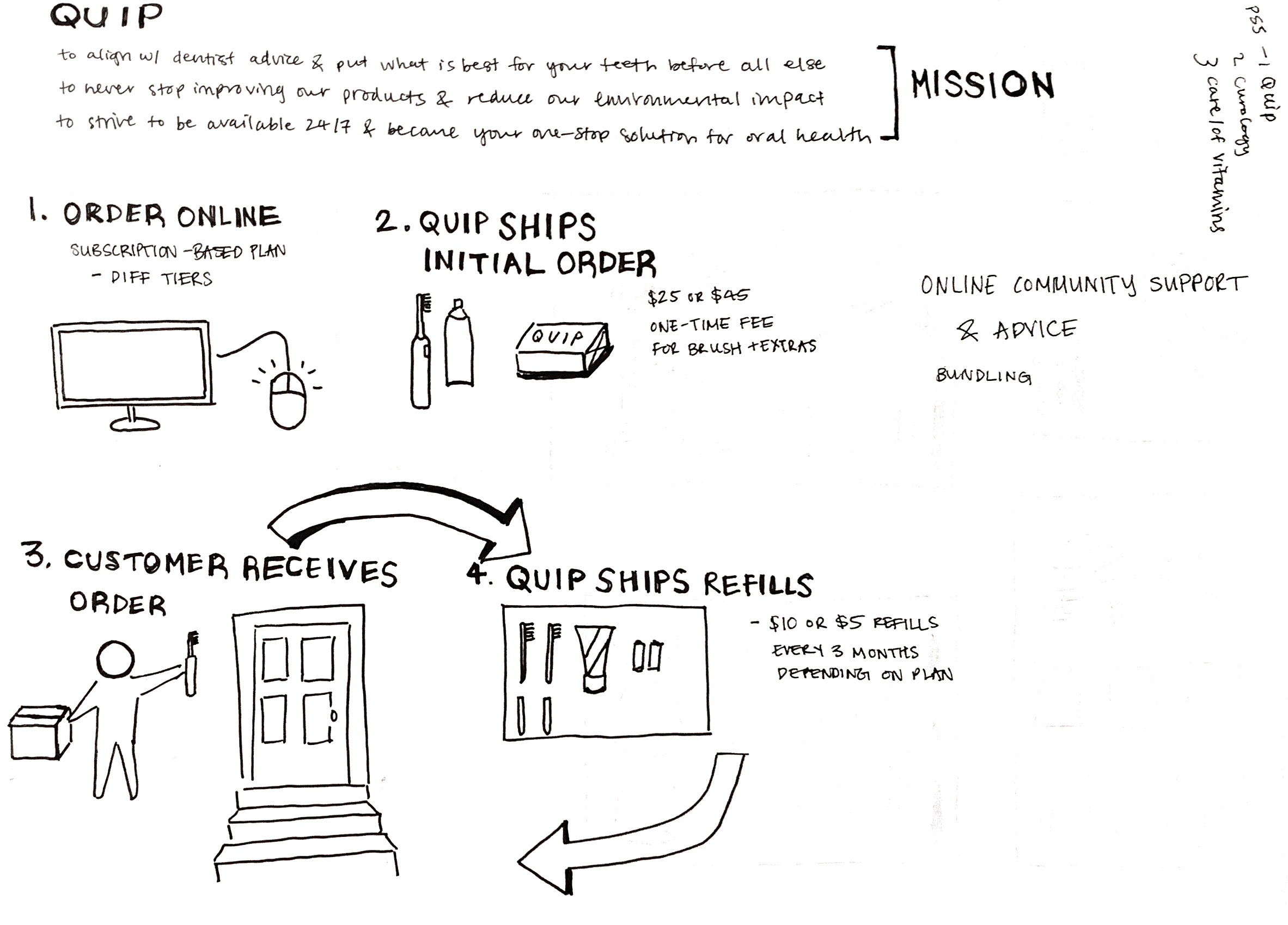
Quip is a electronic tooth brush company that ships brush tops, tooth paste, batteries and other essentials to your door on a regular basis. Quip bundles oral health products so it is convenient for users to purchase online and has several packages at varying costs to suit different needs. They team up with dental experts to create the best products for oral hygiene and offer easily accesible customer support and an online community.
BIRD
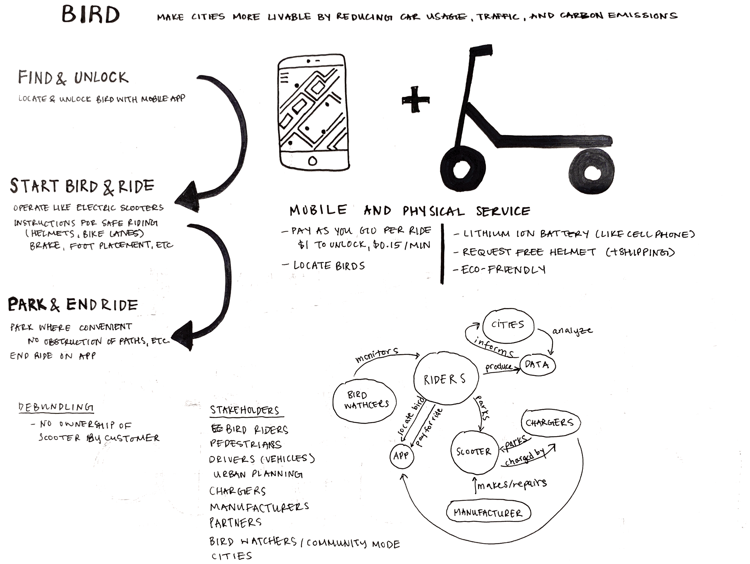
Bird is a ride-sharing scooter company founded in 2017 and operating in over 40 cities around the world. Users can rent scooters starting at $1. Bird works with cities to makes last mile transportation convenient and environmentally friendly.
They differentiate themselves with dockless scooters that can be parked anywhere and debundle the traditional ownership of transport vehicles. They oper- ate as a product service system through the collaboration of many stakeholders.
NARROWING IN
I selected Bird as the company to make my PSS poster on because of the complexity of interactions among the different stakeholders. I did some preliminary research on the company in order to understand any problems they might be facing, when they were created, and any information that might help me have a better overall comprehension of company culture and most importantly how their product service model worked.
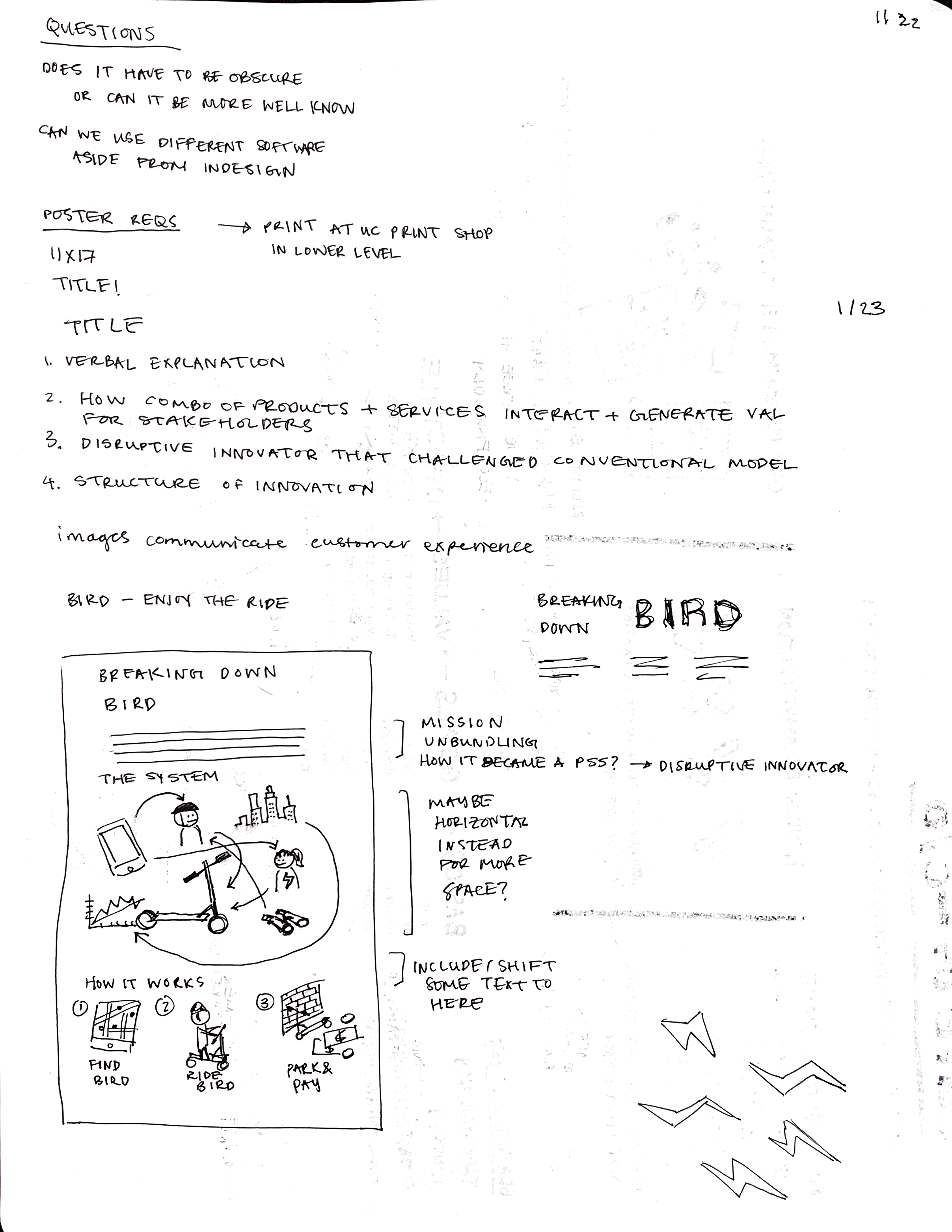
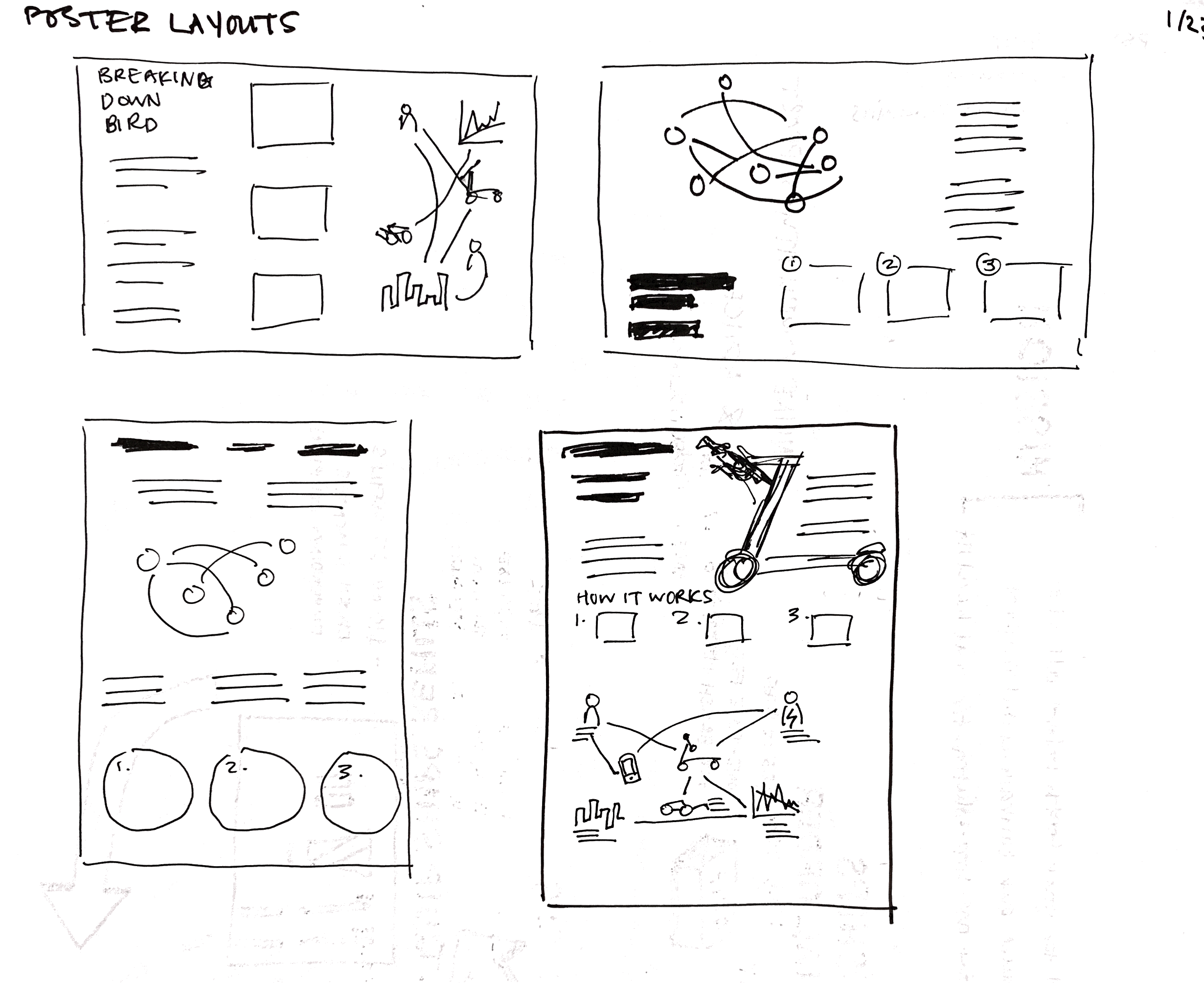
POSTER LAYOUTS
I played around with portrait and landscape formats, but ultimately went with the idea in the bottom right corner which had a simple top to bottom flow and split the poster into thirds.
I wanted to utilize graphics and simple images in my poster to make for a more visual and easier to understand experience.
Because of this, some things I knew I wanted to include were:
- A section that demonstrated in simplest terms how Bird works as a product service
- A diagram showing interactions between stakeholders
- Some text to introduce the company to those unfamiliar to bird.
MOVING TO HIGHER FIDELITY
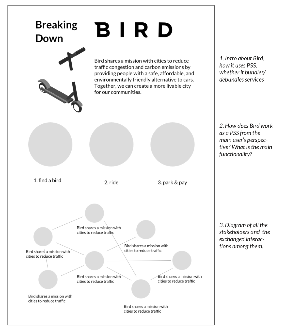
This is a simple digital mockup of the poster format I chose to go with. I added place holders and images in approximate shapes and sizes to get a sense of how the 11 x 17 tabloid space would be filled.
ITERATIONS OF THE DESIGN
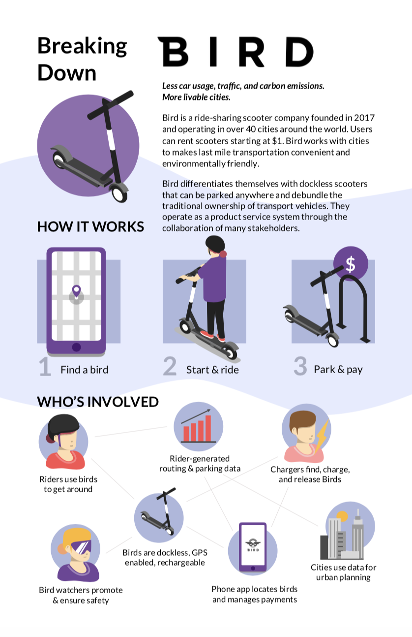

OUTCOME

I wanted to add more to the back- ground and decided to go with a blurred out image for the top third of the page. It also helps emphasize to the audience where the point of entry is for the poster.
I added more hierachical components to the previous blocks of text so it is clear- er to look at. I also broke down sentences into bullets so that it’s easier to skim through.