CLIMBING HOLDS FOR BEGINNERS
Poster Design | Conceptual Models | Individual
CHALLENGE
How can we easily explain a foreign concept to a general audience?
PROMPT
Choosing a topic that appeals to you, create a post of a conceptual model from a concept map which is understandable to a general audience.
DELIVERABLES
3 different concept map ideas, iterations of conceptual model, final conceptual model
SKILLS
concept mapping, sketching, ideating, conceptual modeling, iterative design, communication design
RESPONSE
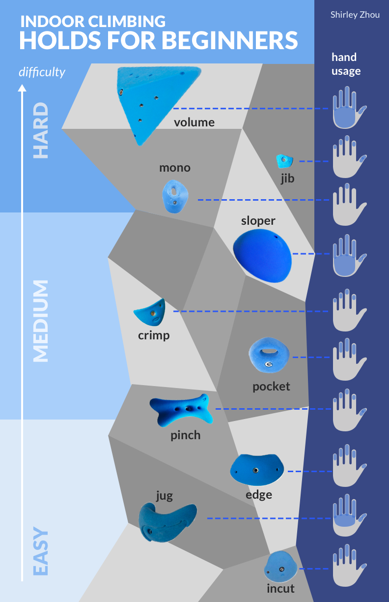
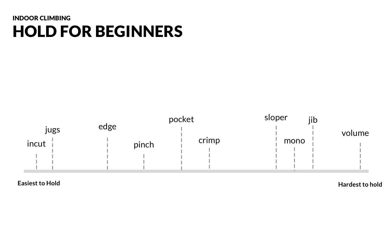
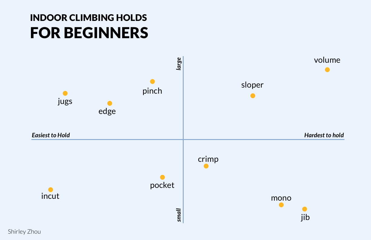
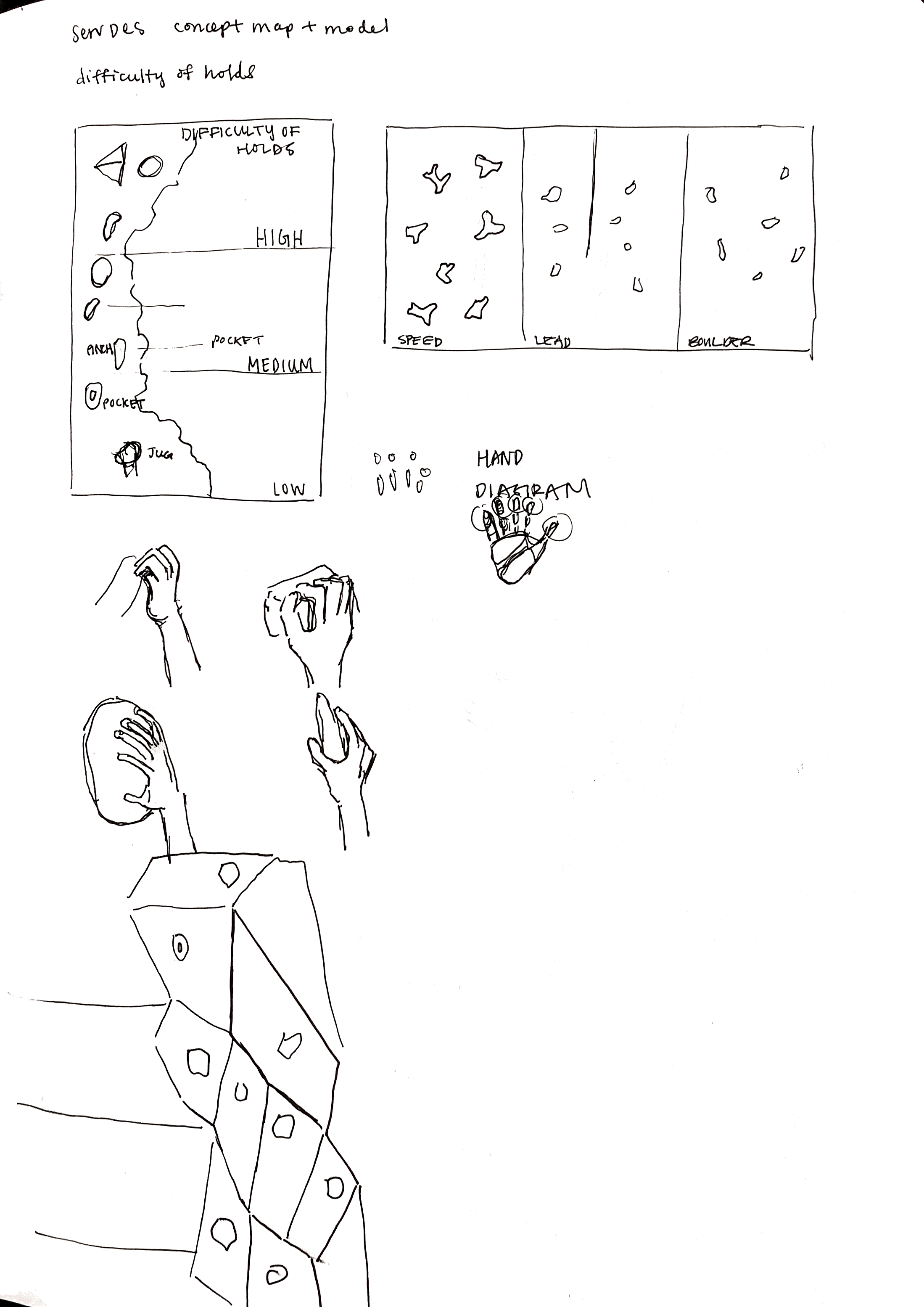
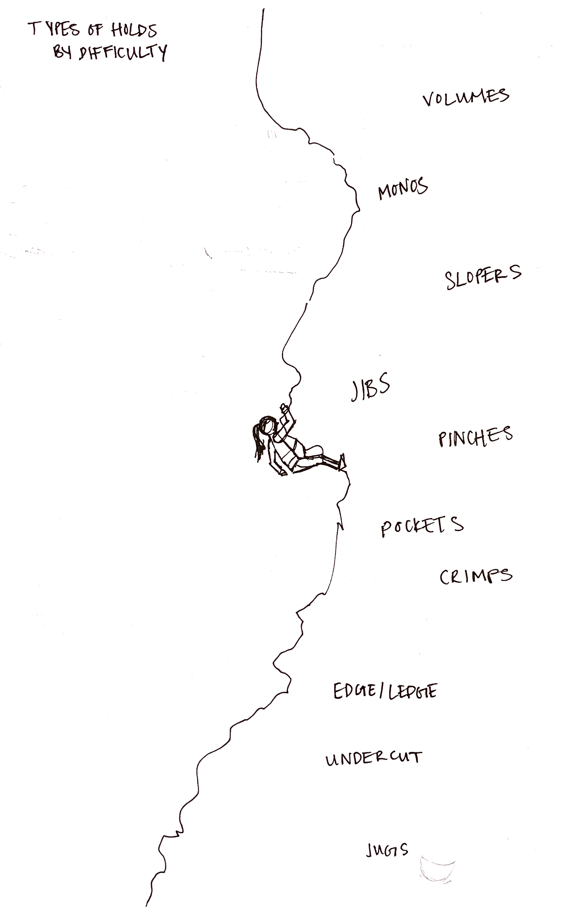
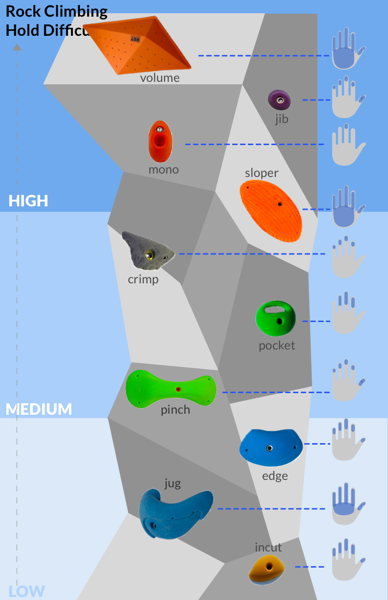
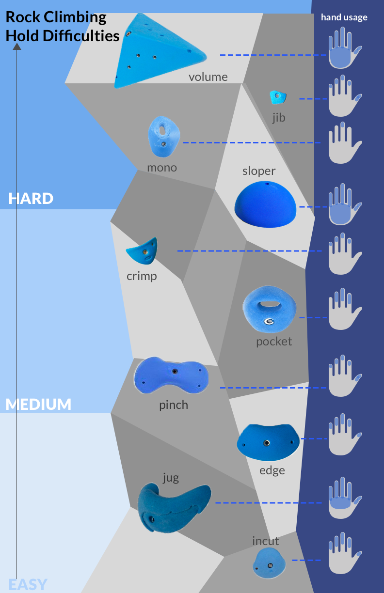
I created a conceptual model which introduces climbing holds to individuals who have never climbed before. The model touches upon three aspects: the difficulty of the hold, the visual and physical details of the hold, and the hand usage involved in grasping the hold.
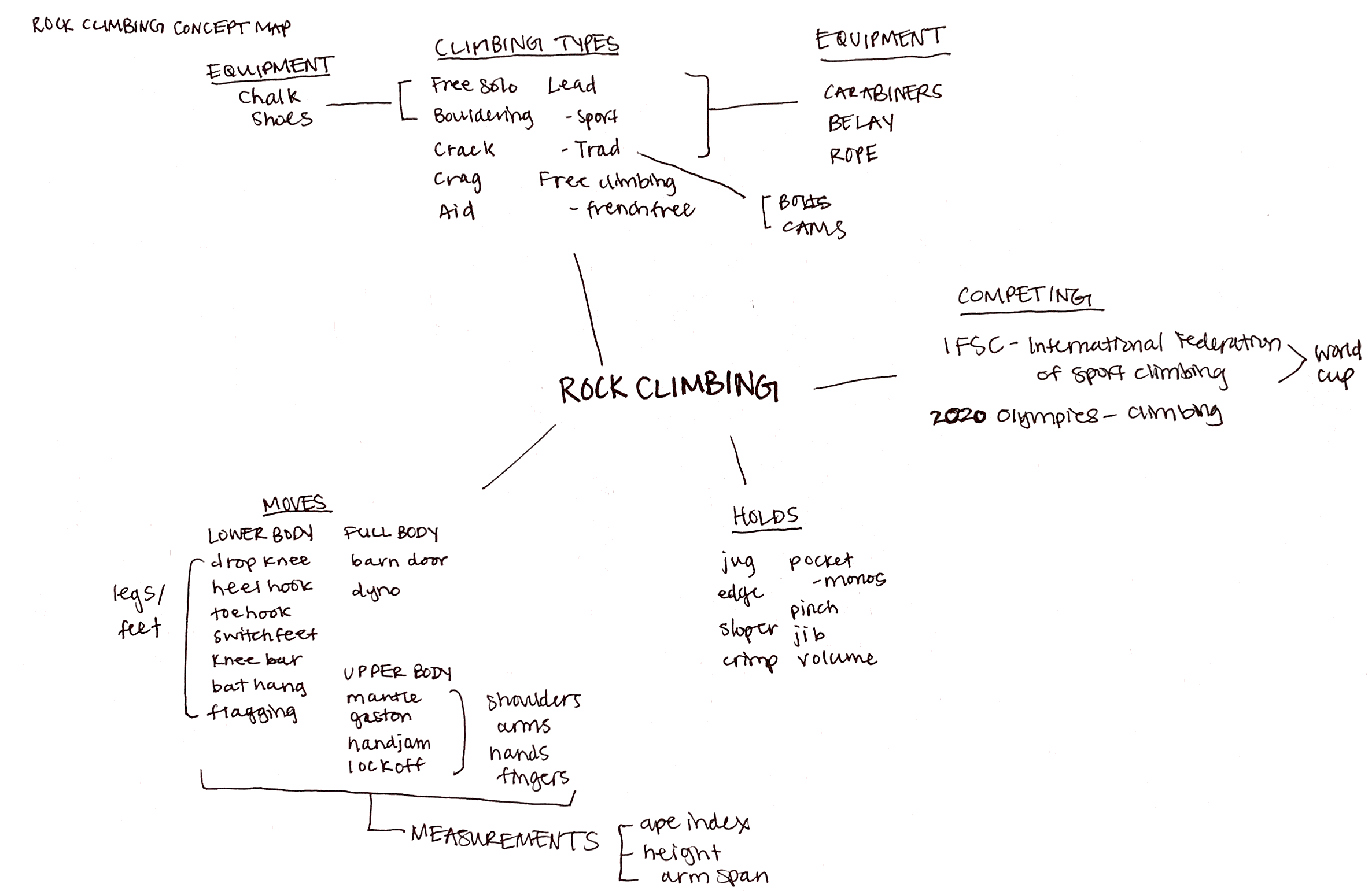
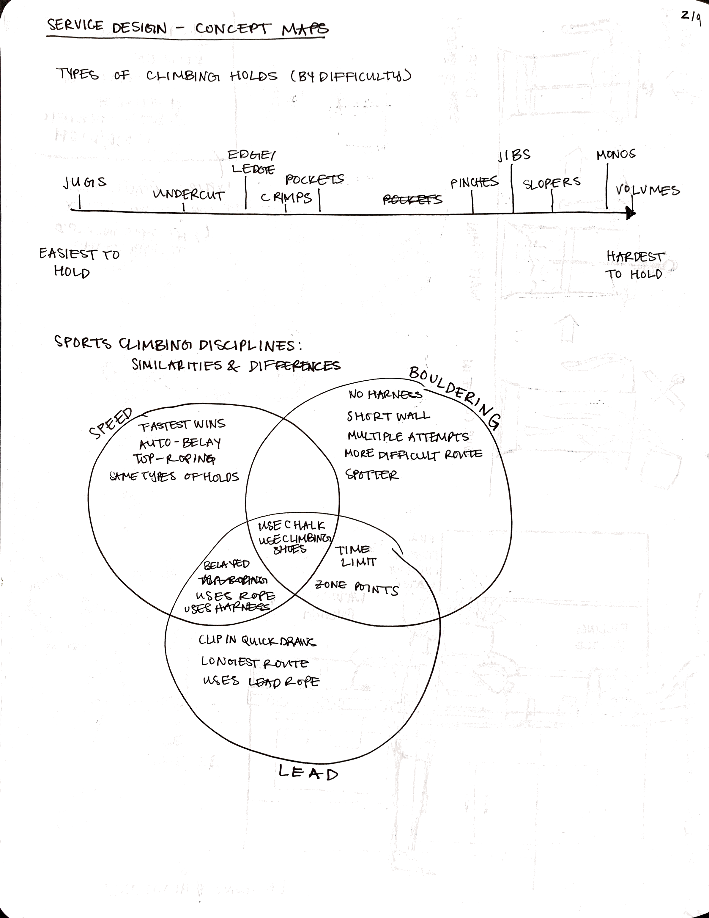
INITIAL CONCEPT MAP IDEAS
DIGITAL CONCEPT MAP
FIRST ITERATION
FINAL ITERATION
INITIAL CONCEPTUAL MODEL SKETCHES
still in progress. will be updated shortly
ITERATIONS OF CONCEPTUAL MODEL
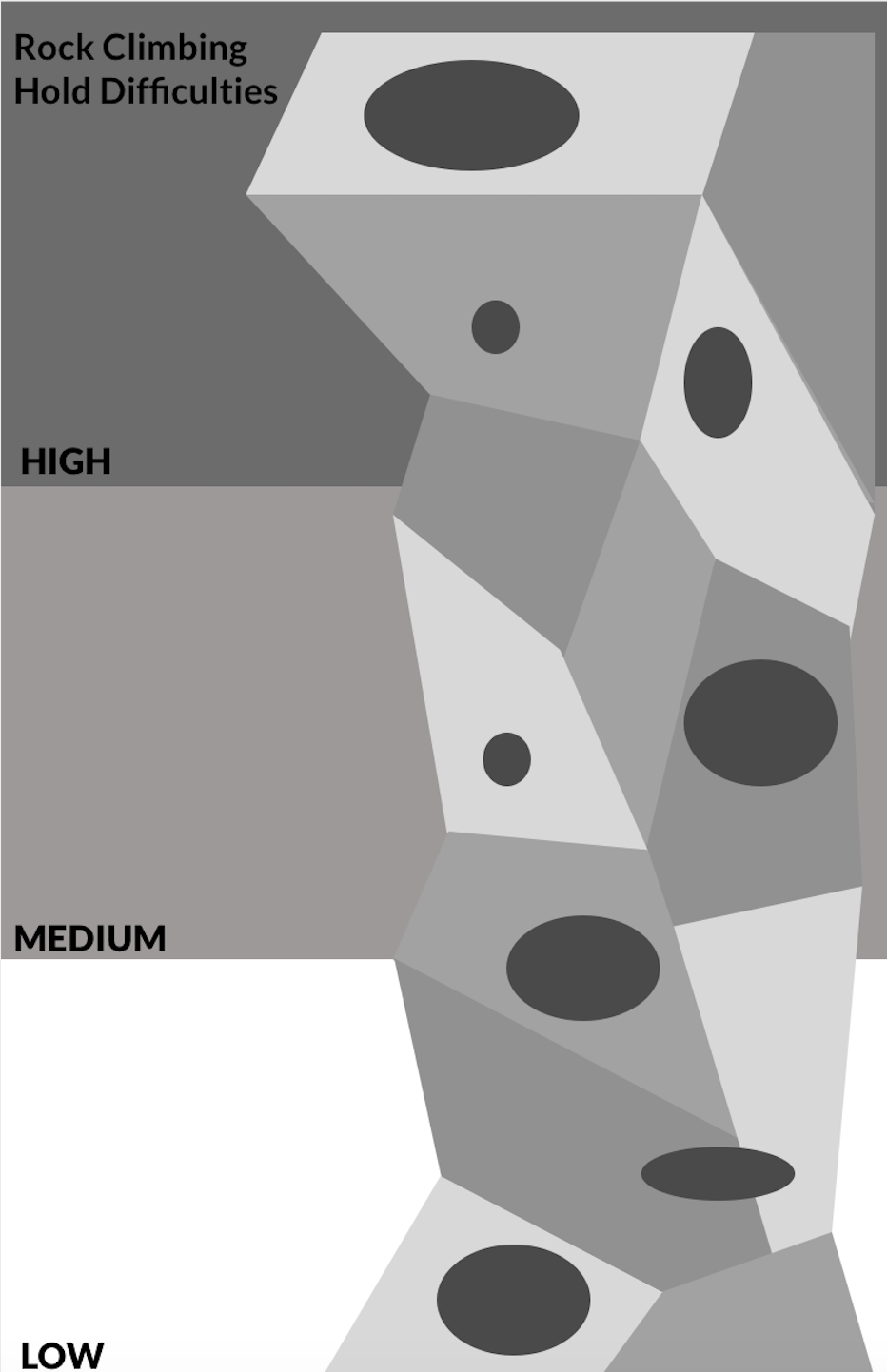
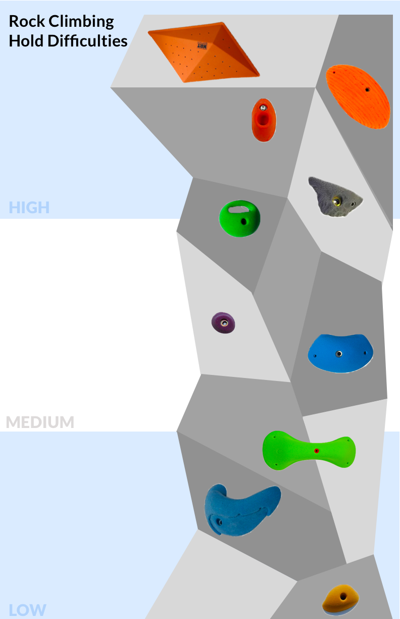
I started out with an initial black and white mockup which just about conveys how I wanted to proceed with the poster visuals. Next I added various types of climbing holds through photoshop and positioned them lower or higher on the wall based on difficulty. At this point I didn't worry too much about the color palette but mostly making sure the information could get across to new climbers. Finally I added on hand positionings. You can see I played around with the positioning for these quite a bit.
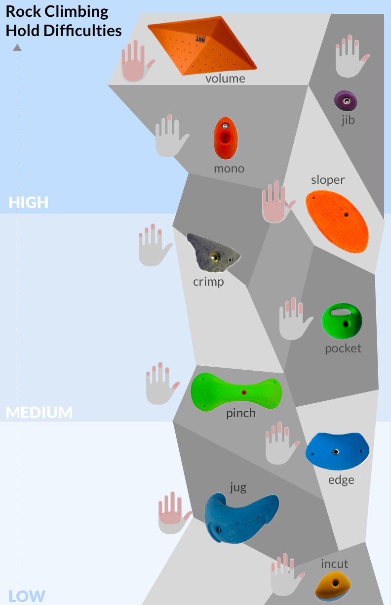
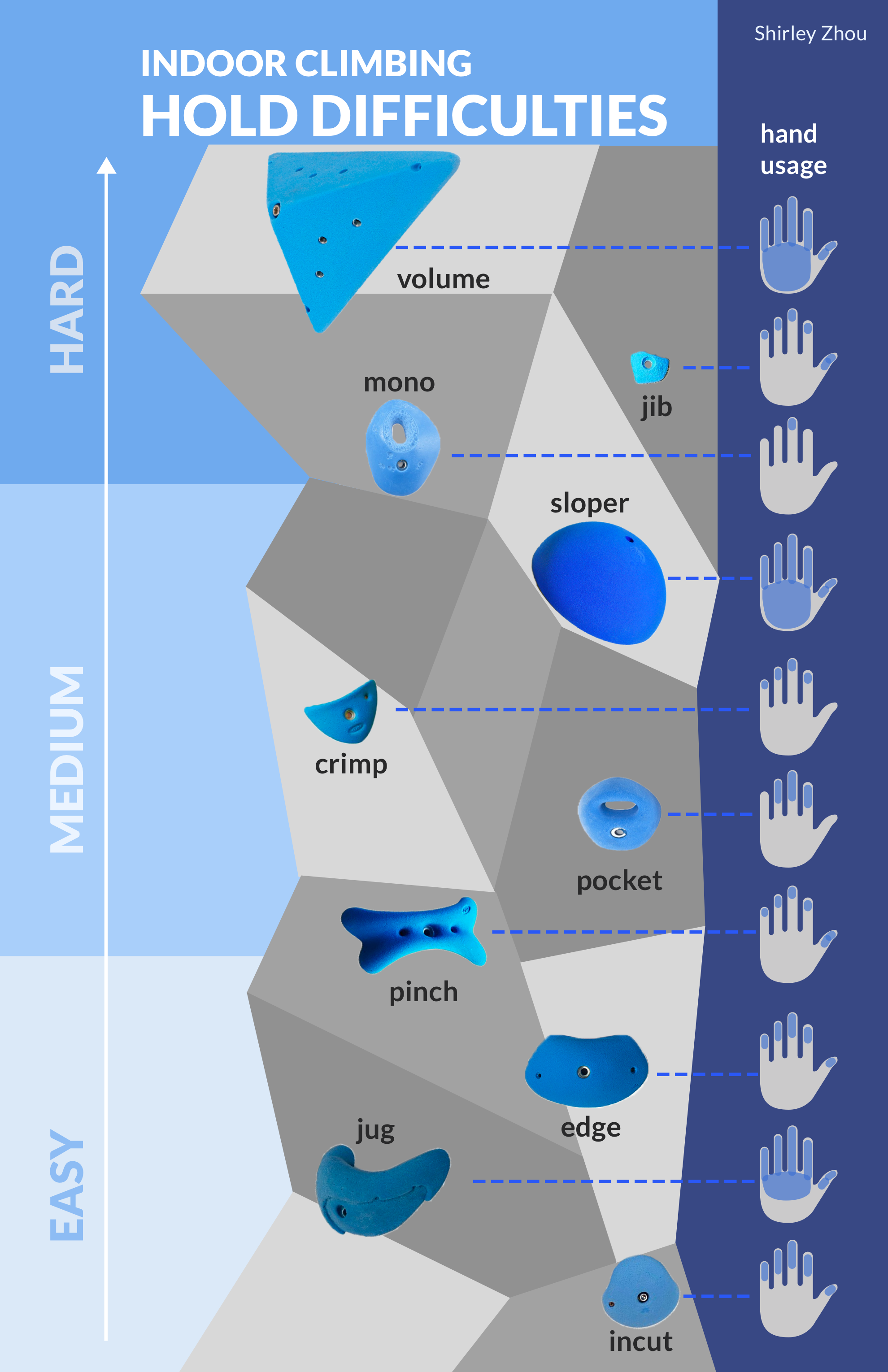
I finally decided to right align the hand positionings creating a more structured look. By creating three columns of information (the difficulties, the holds, and hand positionings) the order which one can view the information becomes more clear. Lastly, I added a suitable title to the poster and brought in a cohesive color scheme.

FINAL POSTER, FINAL THOUGHTS
The audience I want to target with my conceptual model are individuals who either have just started rock climbing or have never climbed before. Because of this, it is really important to include new terminology as well as being able to explain that terminology clearly. This is why one of the challenges is finding the best visuals and mediums to convey my message across.
I don’t believe by just using one medium (eg: only pictures of holds, or only words, or only hand diagrams) will be comprehensive enough for the user to understand so I did my best to use a combination of methods to get my point across.
The story I was trying to get across is teaching beginners how different holds look like, how one might grasp them, and how difficult it will be to hold on. I also tried to get across the relative sizes of holds (eg: crimps are smaller than volumes) since that is not information I was able to literally relay. I hope that in the manner which I was able to display this information, users do not feel too overwhelmed and feel more confident approaching this often times overwhelming-looking sport.
